Projects / UI/UX
Fresh Cars Website Redesign
Building customer confidence and a clearer path to WhatsApp enquiries as the sole website designer during a 2023 internship.
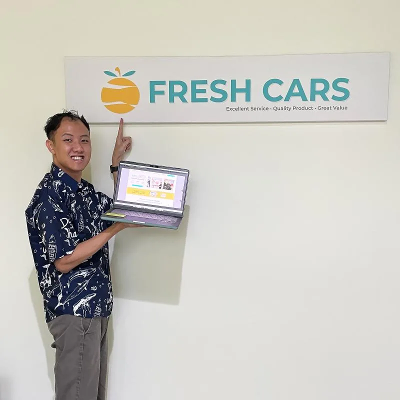
Internship · May–August 2023 · Singapore
Building confidence before the first enquiry
Choosing a rental car also means choosing a company to trust. During my internship at Fresh Cars, I independently redesigned the desktop and mobile website around one objective: help customers feel reassured enough to start a conversation with a salesperson on WhatsApp.
I worked closely with the owner, programmer and marketing lead in a business of approximately ten people. My responsibility was the website design, content direction and design system; the process depended on understanding the company from the inside and working through demanding stakeholder reviews.
My role: UI/UX Design Intern, sole website designer
Scope: Desktop and mobile prototypes, UX writing, visual direction and design system
Tools & approach: Figma, competitor research, AIDA and solution marketing
Primary conversion goal: A WhatsApp enquiry to the sales team
Explore my 2023 Figma prototype ↗
This case study documents my internship designs. The live Fresh Cars website has since evolved through subsequent work and is not presented here as my production implementation.
01 · Understanding the business behind the website
The brief was about assurance as much as appearance. Fresh Cars wanted customers to feel more confident choosing its service over other rental companies. Being on-site helped me understand its culture and the service experience the website needed to communicate.
I researched competitors and studied Fresh Cars’ existing mobile app prototype. That gave me context for the company’s digital experience while I created the rest of the website design system from scratch.
Research approach and its limits
My work involved competitor and comparative analysis, reviewing existing sales channels and looking for missed opportunities in the website experience. The company’s recommendation letter also recognises this research and assessment of the existing UI.
I did not conduct customer interviews. The direction was informed by desk research, the existing app prototype, first-hand exposure to the business and stakeholder feedback. The designs shown here are not presented as customer-validated findings.
02 · Making reassurance visible
I brought customer photographs, review platforms and service benefits into the content hierarchy. The homepage prototype leads with social proof and a clear invitation to contact the team, rather than asking visitors to work out the next step for themselves.
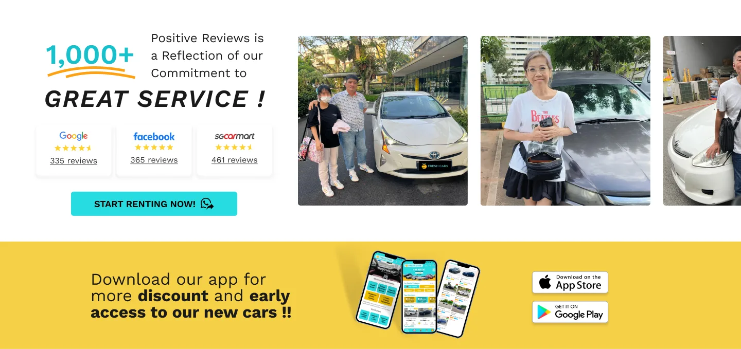
Desktop homepage proposal, 2023. Review counts and promotional statements are historical prototype content.
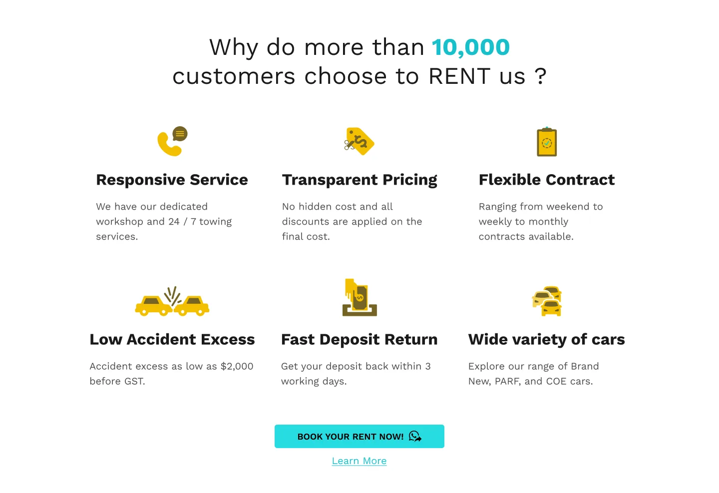
The benefits section makes the reassurance more specific: responsive service, transparent pricing, flexible contracts, accident excess, deposit return and vehicle choice. These are the topics the design surfaces to help visitors understand the rental offer.
03 · Connecting content to a conversation
I used AIDA and a solution marketing approach to structure the content around the customer’s decision, with WhatsApp as the intended hand-off to a salesperson.
- Attention: Introduce Fresh Cars through customer imagery and visible review evidence.
- Interest: Explain the service benefits and the practical details of renting.
- Desire: Present vehicle options and a rental journey that feels understandable.
- Action: Place recognisable WhatsApp calls to action at relevant points, so visitors can move from browsing to asking questions.
How the rental steps support the enquiry
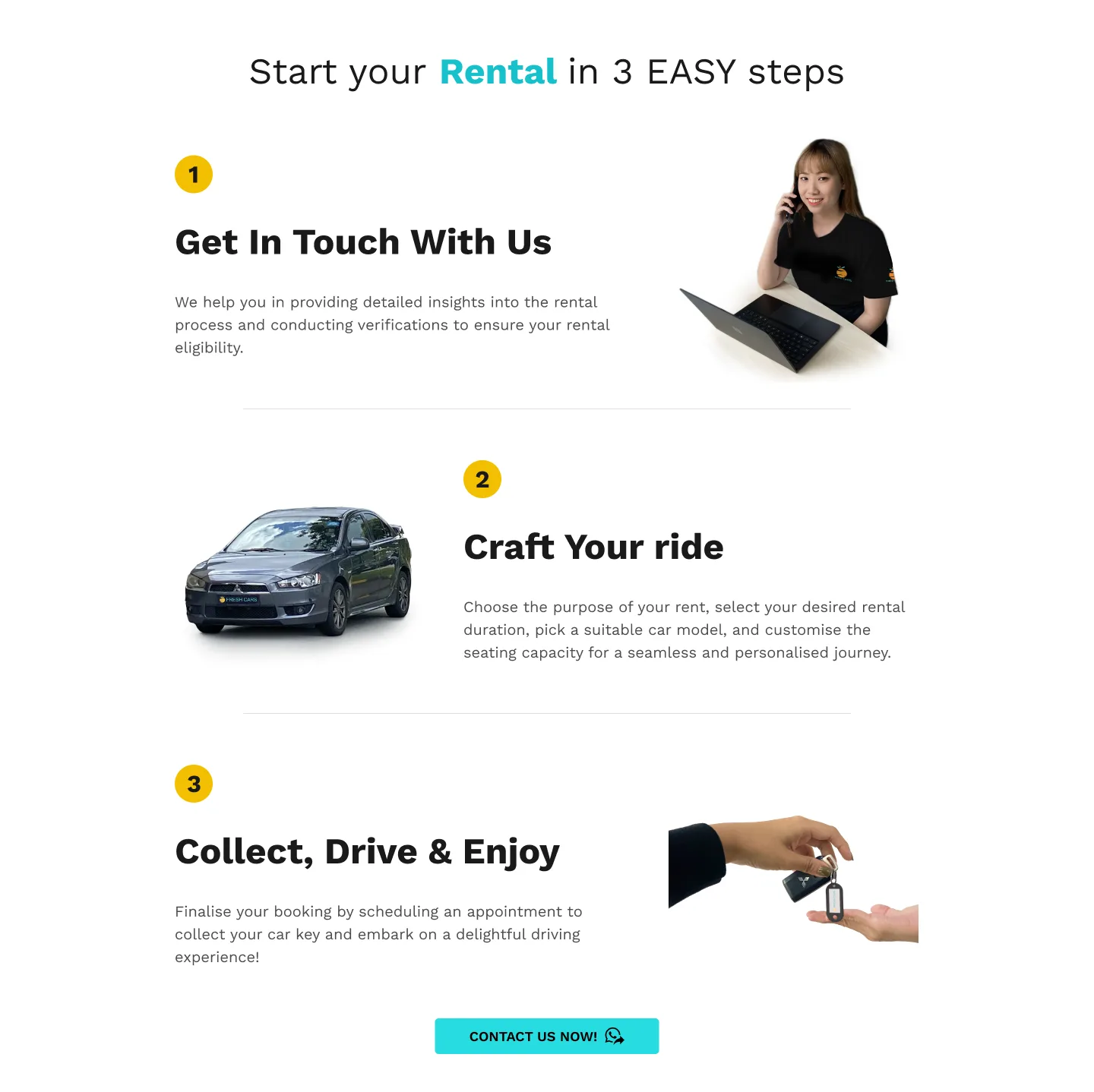
The prototype explains the journey in three stages: get in touch, choose the rental arrangement and vehicle, then collect the car. This makes the conversation with the sales team part of a visible process.
04 · A system for desktop and mobile
I developed the typography, colour scheme and reusable website components from scratch, using the existing app prototype as context. The Figma file contains a style guide and component groups for the homepage, fleet, product details, contact, FAQs and other page types.
The system pairs a yellow-led brand palette with teal accents and Work Sans typography. Desktop and mobile layouts give the same content different arrangements while retaining recognisable headings, benefits and calls to action.
View the style guide and mobile example
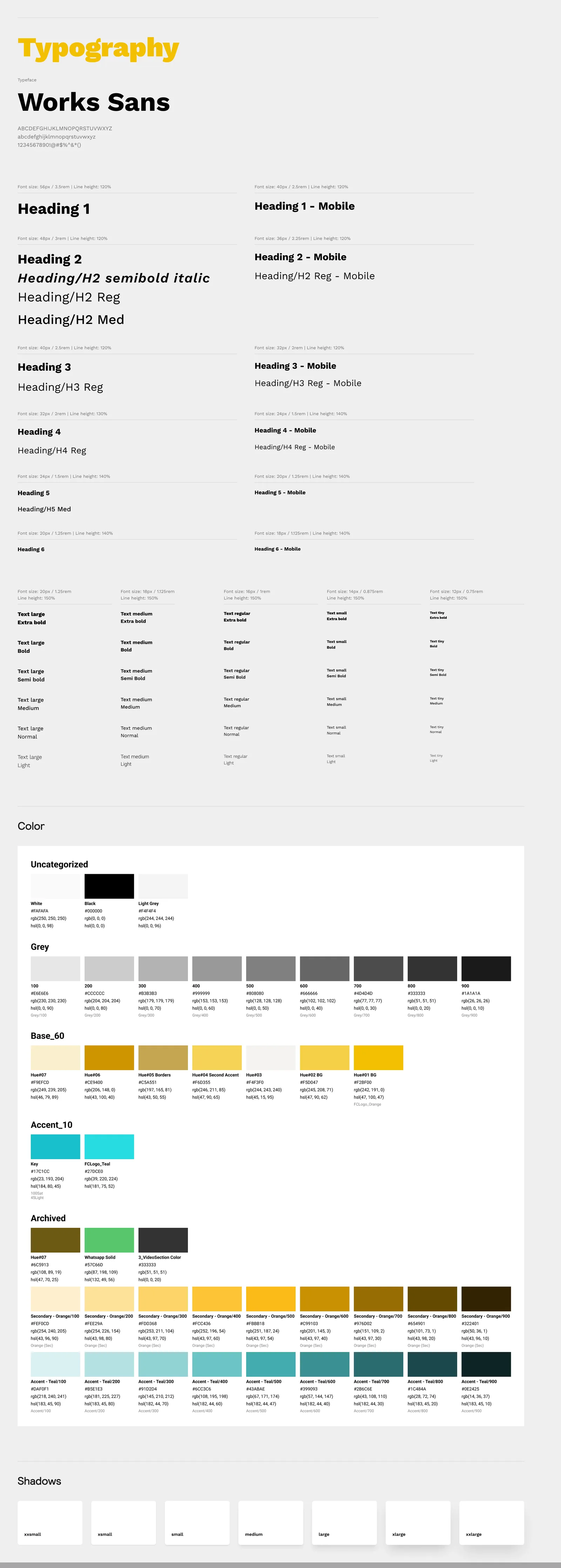
The style guide establishes shared visual rules across the website.
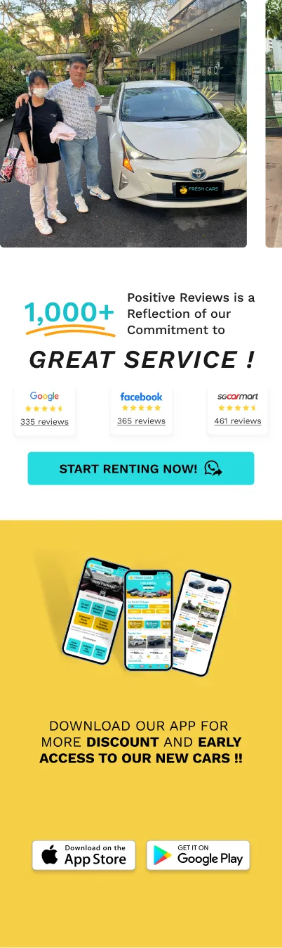
The mobile homepage keeps reassurance and the route to enquiry visible in a narrower layout.
05 · Designing within a small company
Stakeholder review was one of the toughest parts of the internship. Working closely with the owner, programmer and marketing lead meant the design had to communicate the company’s culture as well as meet the brief. Understanding that culture was central to the work.
Weekly touchpoints and iterative reviews kept the design connected to the business. Working as the sole website designer also meant taking responsibility for the details while staying open to feedback from people with different priorities.
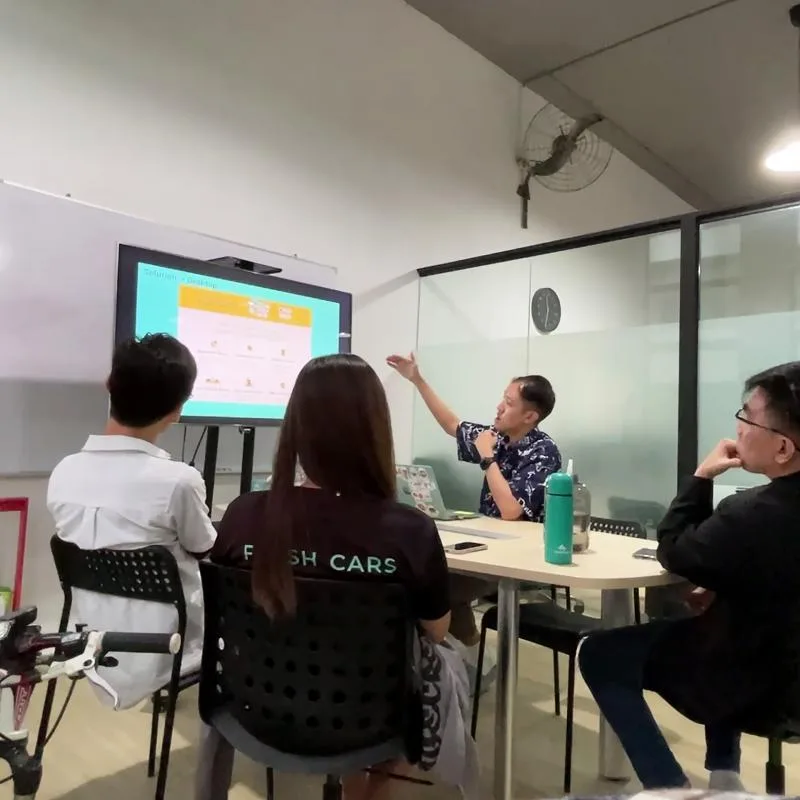
Presenting and discussing the website direction with the team.
Extending the experience beyond the screen
Alongside the website, I designed logo banners and helped coordinate the customer-room interior renovation. This broadened the internship from digital screens to the physical setting in which customers encountered the brand.
It reinforced the importance of conveying a consistent company identity across the website, sales conversation and customer-facing space.
06 · What I delivered and what I learned
- Desktop and mobile website designs and interactive Figma prototypes.
- Content direction using AIDA and solution marketing, with WhatsApp enquiries as the primary action.
- A website design system covering typography, colours and reusable components.
- Brand signage and contributions to the customer-room renovation.
In its recommendation dated 18 August 2023, Fresh Cars recognised my research initiative, independent ownership, regular communication and willingness to iterate. That feedback is a useful record of how I worked with the team.
My biggest takeaway was that understanding a business is part of the design work. A convincing website needs to express how the company wants customers to feel, and stakeholder alignment takes patience alongside visual and technical skill.
Project boundaries and what I would validate next
The outcomes documented here are design deliverables and stakeholder feedback. I do not have post-launch analytics and am not claiming an increase in enquiries, conversion or customer trust.
With an opportunity to validate the direction, I would test whether customers can identify the rental terms, explain the next step and find the enquiry action. I would also measure WhatsApp click-through and the quality of resulting enquiries.
View the current company website ↗ — this reflects subsequent development beyond the internship prototype.